AI Assistance
These days, every app wants to look smart — so they bundle in some kind of AI. Whether it’s rewriting your post, generating hashtags, or just finishing your sentence for you, it’s everywhere. The question is no longer “Should we add AI?” — it’s “How much AI can we add before things get weird?”
Fedica keeps things minimal — no AI circus, no glowing robots in the corner. But even small features need thoughtful design. And when something feels off — inconsistent styles, confusing feedback — users lose trust in the whole experience.
That’s what we’re here to fix.
Inconsistency in controls
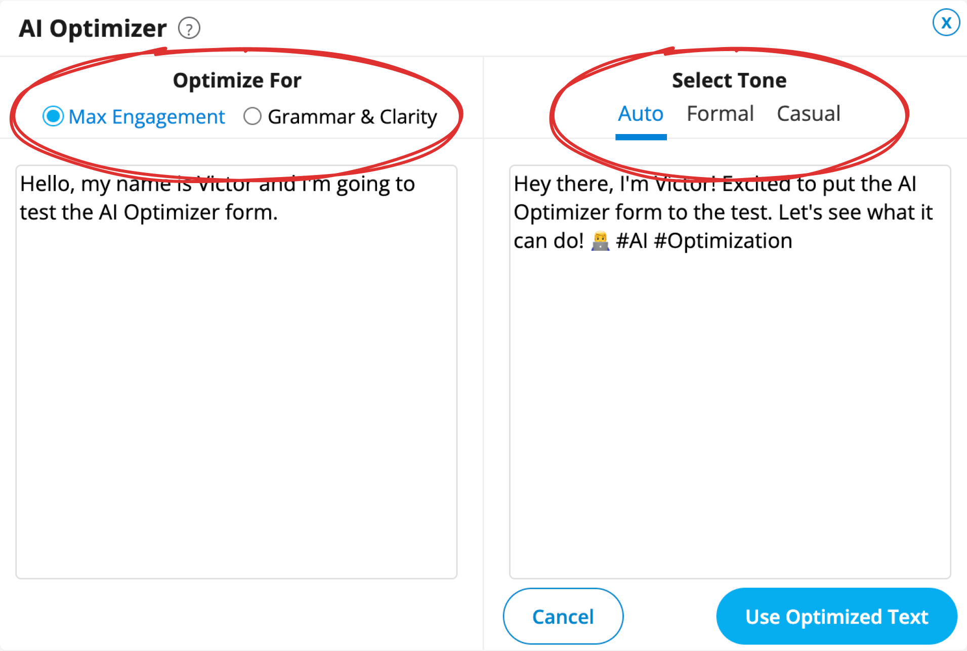
Here’s a small but noticeable inconsistency: two UI elements that act the same — but look completely different.
On the left, you have radio buttons for optimization goals. On the right, tabs for tone selection. Same interaction pattern, different visual language — and that disconnect makes things feel less thought-through.
And those labels? They restate what’s already obvious. Instead of helping, they just add noise.
Clearer feedback
When it comes to AI-generated content, it’s important to clearly show what came from the AI — and what didn’t.
That’s especially true for textareas. If you’re showing both the user’s original version and the AI-optimized one, the distinction should be obvious.
Here’s a basic mockup using our existing modal template. It’s still rough — no validation yet — but it’s a starting point.
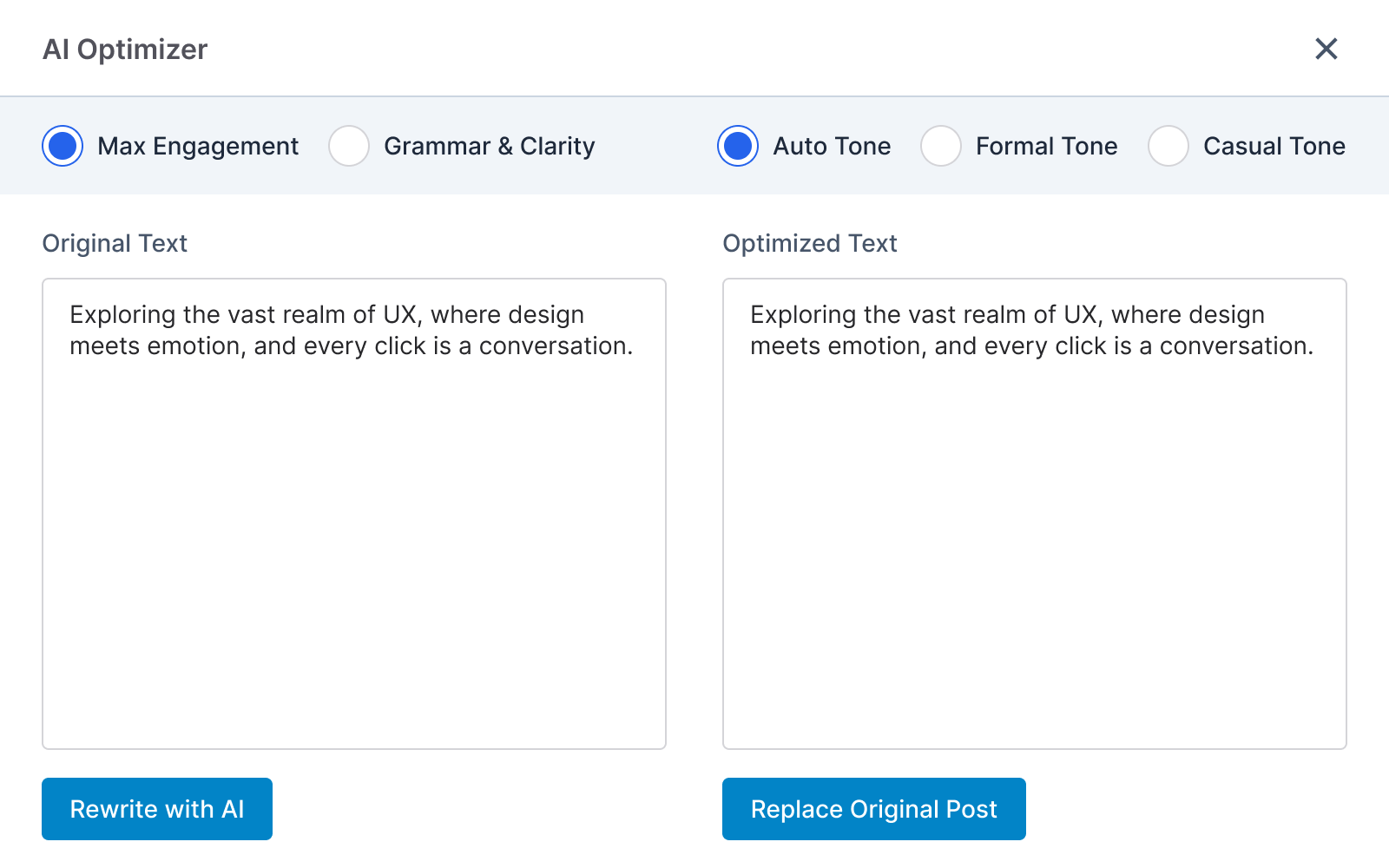
We’ll iterate later. For now, the goal is clarity — and making sure the AI assistant doesn’t look like it was thrown in last minute.