Media Attachments
The second action we’ll add to the post form is media uploading.
Usually, it’s a photo, a GIF, or a video. But depending on the platform, other file types might be allowed too — for example, LinkedIn lets you upload PDFs and turns them into carousels.
What issues do we have?
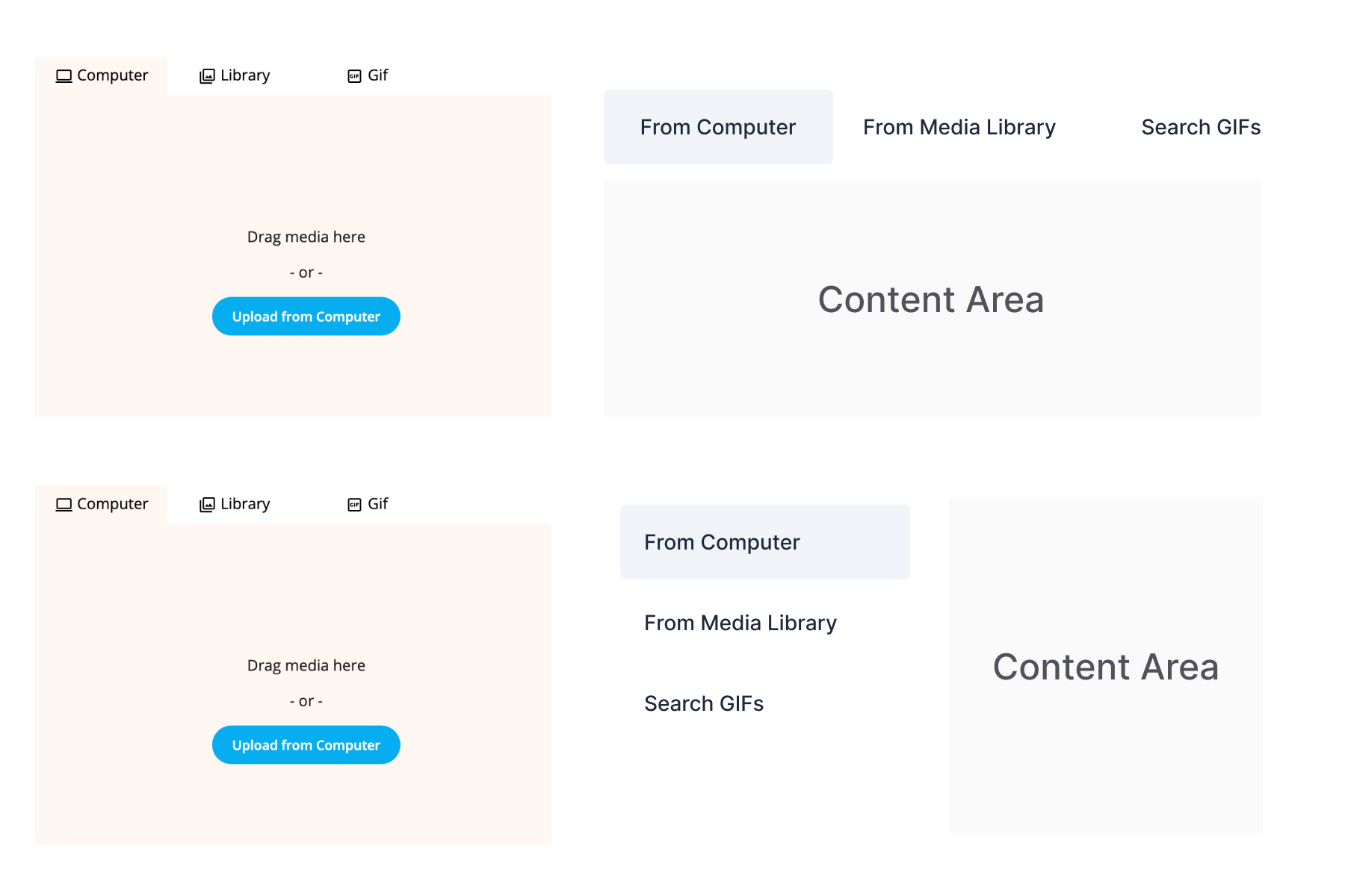
Tabs: not great
There’s no clear separation between the upload area and the tab UI. Classic tab styling looks outdated and blends into the layout. Pills feel more modern and easier to style for this case.
No file info upfront
Users don’t see file requirements — no mention of size limits, allowed formats, or how many files can be uploaded. That’s a recipe for errors. Better to show that info immediately instead of punishing users after the fact.
Pagination logic is fuzzy
Pagination feels broken. Buttons behave oddly and don’t follow normal conventions.
There are two ways to go here:
- Infinite scroll (meh, accessibility?)
- Classic pagination (safer, boring but fine)
Why classic might be better:
- Users don’t always realize they can scroll inside a modal.
- Infinite scroll can confuse keyboard users and is harder to control.
- Pagination provides clear steps and a mental model — “I’m on page 2 of 5.”
- It also makes things easier to bookmark, debug, or return to later.
Overall, classic pagination is more predictable, more accessible, and easier to maintain — even if it feels less sleek.
Auto-loading GIFs
There’s no reason to throw an army of animated gifs at the user as soon as the tab opens. It’s loud, distracting, and eats up data for no reason.
Let users search or opt-in to see trending GIFs. Don’t auto-launch them into chaos.
Clicking outside doesn’t close the modal
Ideally, modals should be dismissible in three ways:
- Pressing Esc
- Clicking the close icon
- Clicking outside the modal area
Right now, clicking outside does nothing. That breaks expectations — and patience.
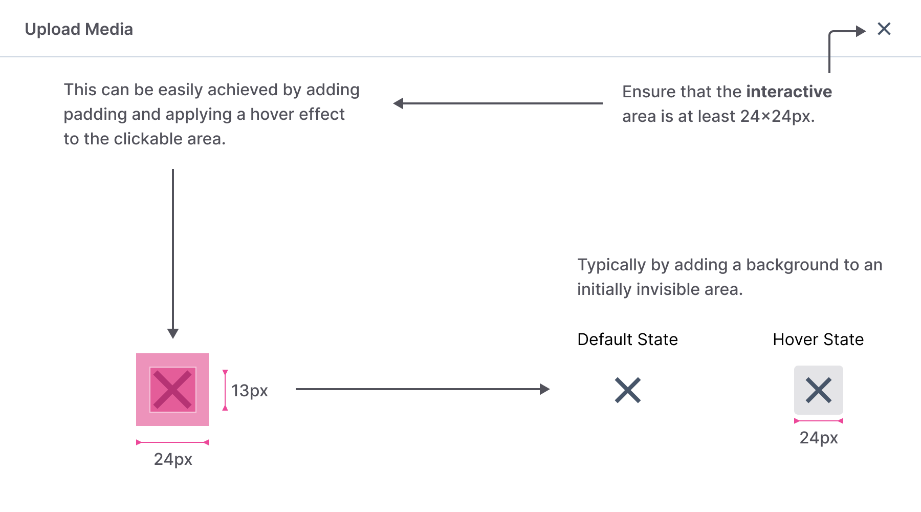
Close icon size
Is the close icon too small? Visually, yes. But also functionally.
WCAG recommends a minimum of 24×24px for interactive elements. For AAA compliance, it’s 44×44px.
In our current layout, it’s just 20×20px — a pixel hunt. Needs fixing.
Solutions
Define the modal structure
Start with a consistent modal component: header, body, and optional footer. Action buttons may or may not be present, but clarity is key.
Also, ensure the clickable area around the close icon meets accessibility size guidelines.
If you want to dive deeper into size rules, read this article.
Use pills instead of tabs
Switching to pills (or pill-style links) separates controls from content. It’s visually cleaner and avoids the "blending UI" issue.
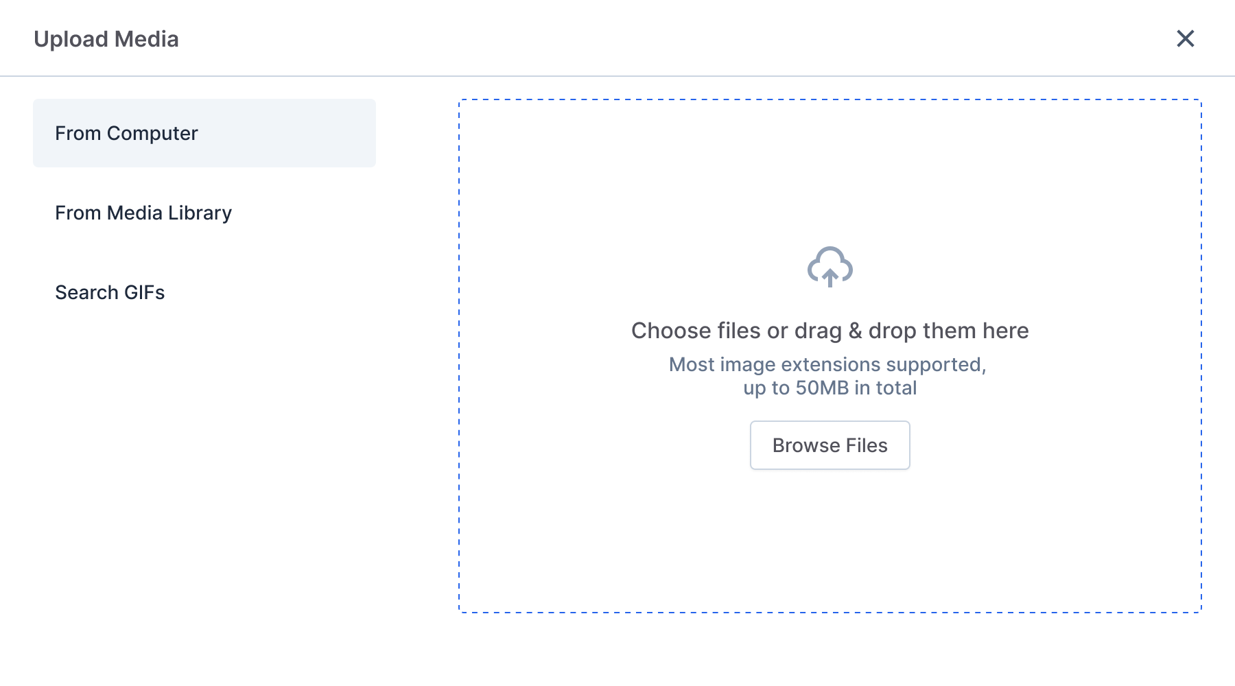
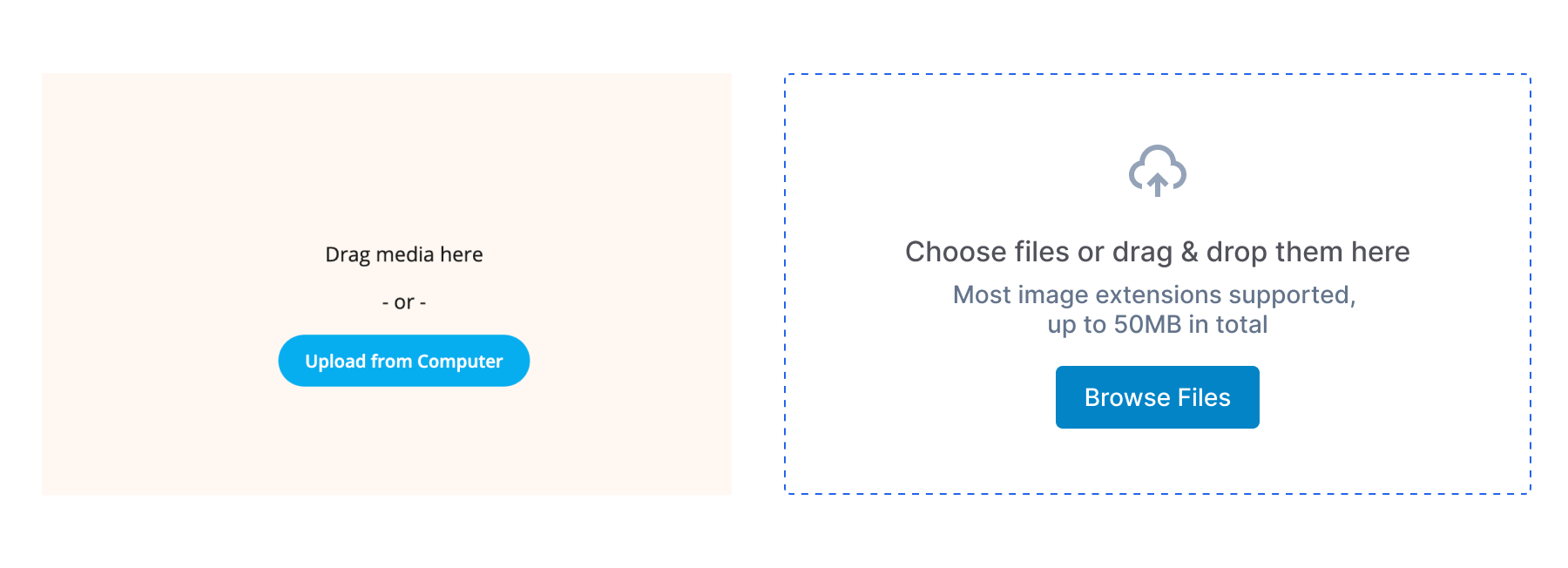
Clarify upload area
Always show file rules — size, types, limits. Don’t let users walk blindly into error messages.
That’s just good heuristic #5 — error prevention.
Good error messages help. But good design prevents those errors from happening in the first place.
Smarter GIF handling
Instead of auto-loading a pile of GIFs, let users type what they want. The current approach is unpredictable and doesn’t match how people actually use GIFs — they usually search for something specific.
Do people still post with GIFs? Sure. But not as often as they reply with them. Most often, it’s memes or reactions — and those tend to be picked deliberately, not randomly.
If anything, a checkbox like “auto-show trending GIFs” would be a better compromise.
Bonus idea: let users save their favorite GIFs — a small feature, but useful if they reuse the same stuff.