Basic Post Form
One of the key reasons people love Fedica is pretty simple — you write one post, and it goes everywhere. According to the CEO, this is exactly how most users approach posting: quick, easy, all-in-one. 👌
Naturally, our first step is building a form that makes cross-posting effortless.

Social accounts under microscope
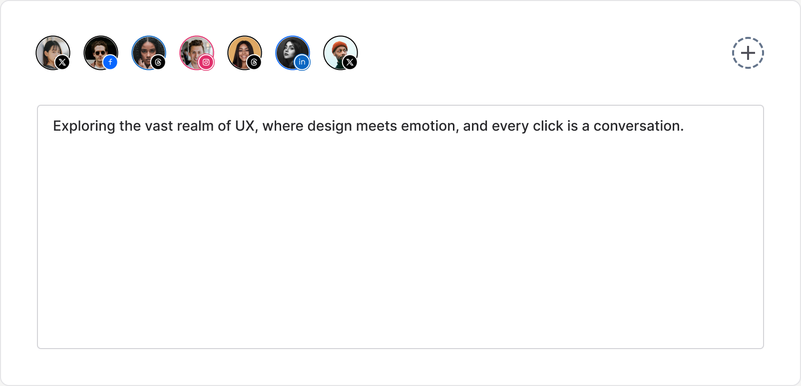
By default, all connected accounts are selected when you create a post — that’s the typical scenario. But users should still have the flexibility to pick specific accounts. And that’s exactly why we need a good social account component.
A "social account" here means a combination of a platform and an avatar. You might have two Twitter accounts, one LinkedIn, one Threads — each appears as its own selectable item.
Let’s take a look at how these currently work.
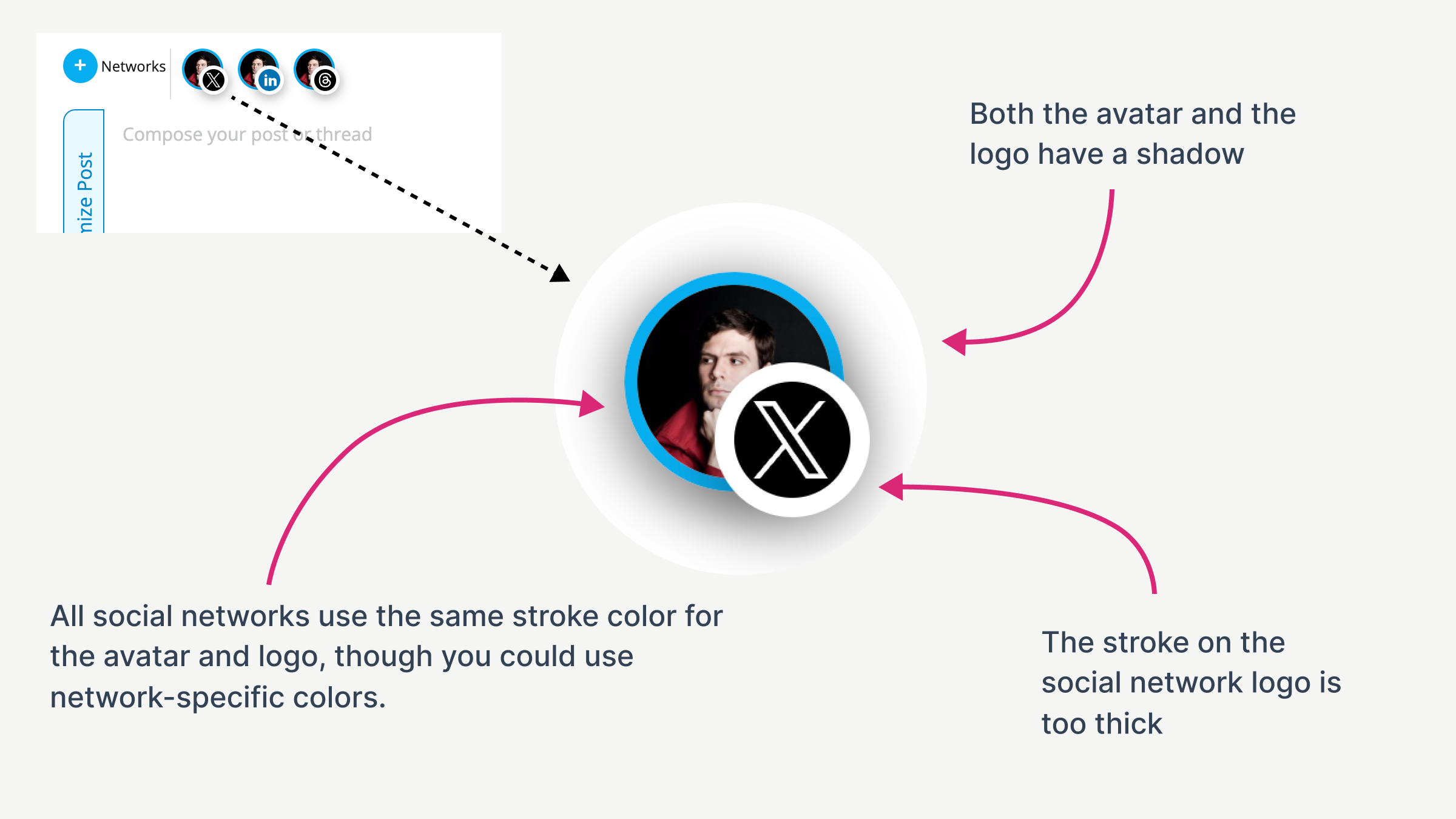
Default State
There are a few visual issues with the current design:
- Both avatar and social icon have shadows — feels visually heavy.
- Social icon stroke is too thick, and there’s no padding inside the circle.
- All account borders have the same color — even though we could use platform colors to help recognition.
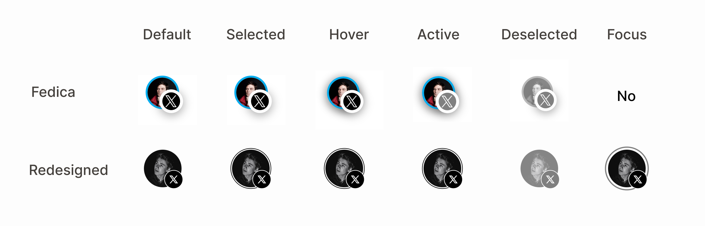
Other States
This component should support a bunch of interaction states:
- Default — untouched, neutral view.
- Selected — account is chosen (checkbox energy, but prettier).
- Hover — visual feedback on mouse over.
- Active — when clicked or tapped.
- Deselected — excluded from the post.
- Focus — keyboard navigation highlight.
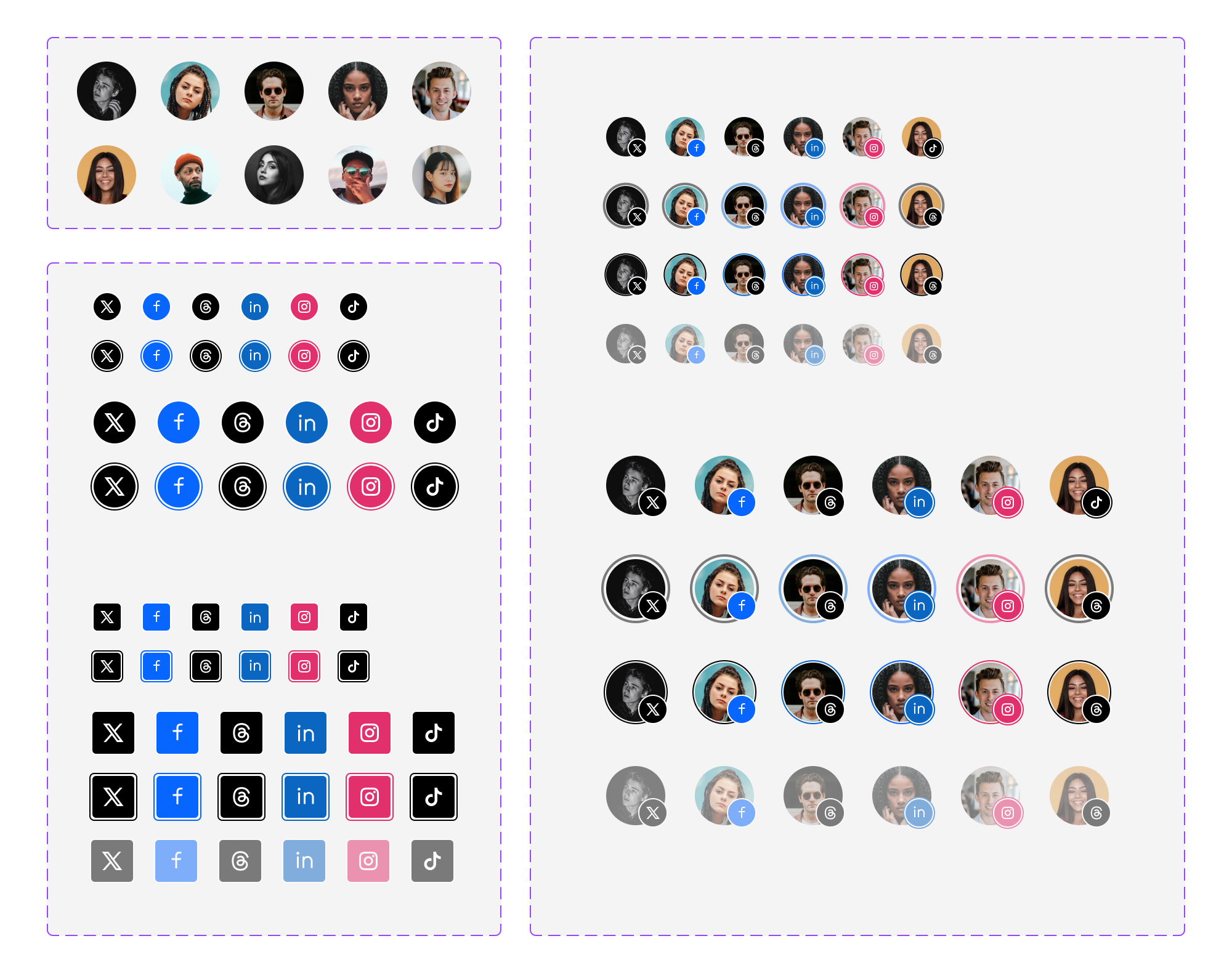
Variations
Different platforms, states, sizes, border radius — you get the idea. No need to show every network right now — a few examples will do the job.
Making the form
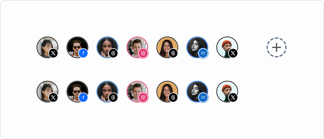
List of Accounts
Now that we’ve built the social account component, we can line them up. This forms the part where users pick where their post will go.
There’s also a little “plus” icon. But given that users rarely change their connected accounts, it’s debatable whether it’s even needed. And if you can add an account... should there be a way to remove it too?
For now, the plus icon stays — but let’s make it optional in the component logic.
Textarea
Then comes the classic textarea for entering post content. Nothing fancy here — it just works.
Icons
And of course — action icons. Polls, file uploads, AI assistant — all the usual suspects.
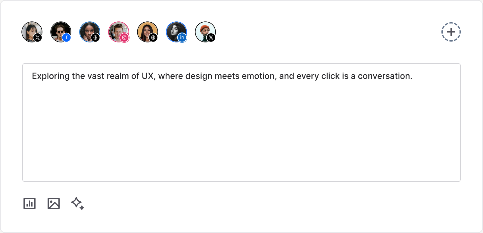
The AI icon feels slightly out of place though — other icons have a frame, but this one doesn’t. Not a big deal for now, but something to fix later.
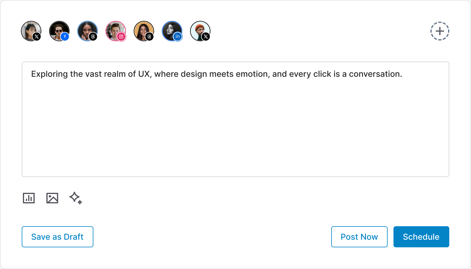
Primary and Secondary Buttons
Now we get to the action buttons. The key question is — which action is most important?
According to the CEO, scheduling posts happens way more often than publishing right away. So it makes sense to highlight scheduling as the primary action.
One more thing
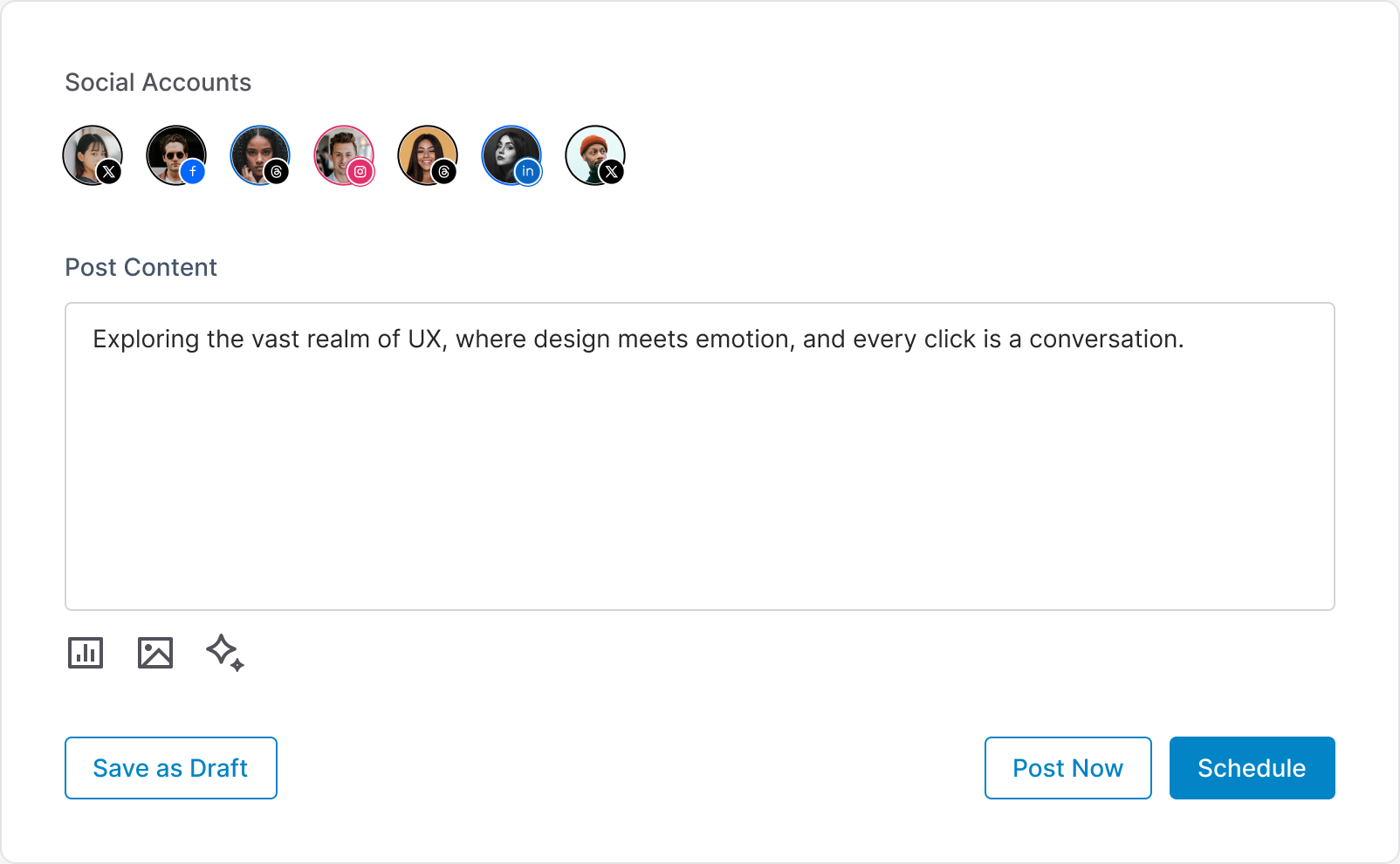
Labels matter. Even if your form looks minimal and elegant — labels are still your friends.
In fact, the list of social accounts is basically an input that returns multiple values. So a label wouldn’t hurt here either.
Also, we’re hiding the add icon for now — since it's not very clear whether we need it or not. But the component should support both options.
Even though it looks quite simple, trust me — interfaces can become cluttered very quickly.