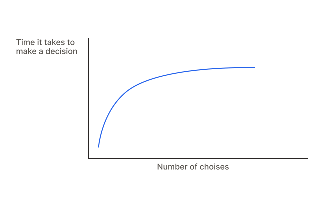
Hick's Law
The time it takes for a person to make a decision increases with the number of choices logarithmically.
Hick's Law is a principle in UX design that states the more choices you present to a user, the longer it will take them to make a decision. In other words, too many options can overwhelm users and slow down their interactions with your site or app.
Note that there's a difference between simply showing all options and presenting them in a digestible way.
In many situations, it's just not possible to limit the number of options.
For example, in an e-commerce app with dozens of categories and products.
The goal of Hick's Law is to simplify the decision-making process — not eliminate it entirely.
That’s why we group products into categories, show popular items first, and use icons to help users scan.
This makes it easier for users to decide what to do next.
In some cases, it’s impossible to simplify. That’s okay — there are always exceptions.
Sometimes users already know what they want, and even a cluttered UI won’t slow them down.