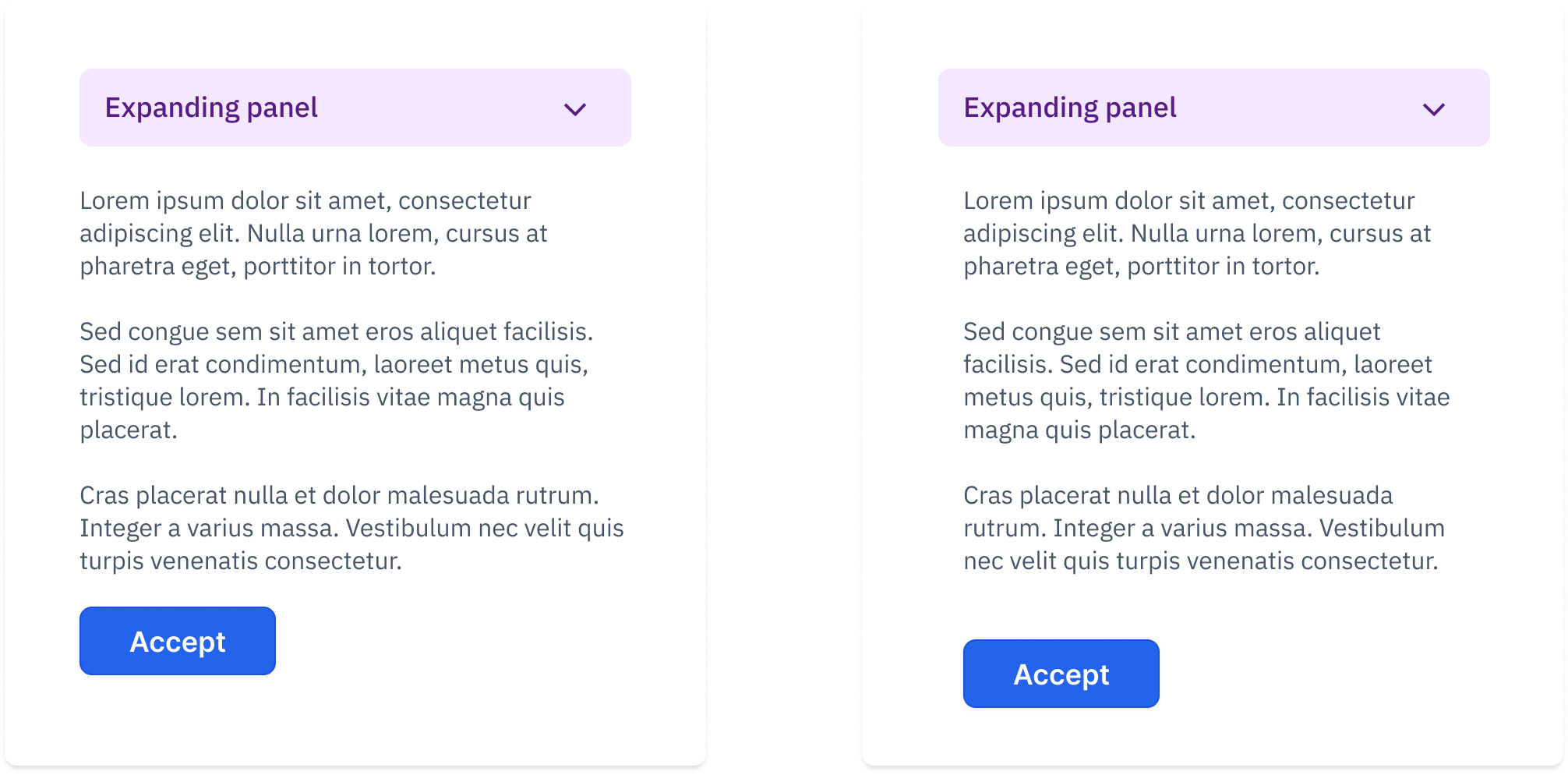
Alignment
Alignment refers to the arrangement of elements in your design so that they line up in a visually organized and logical manner.
The principle is pretty much self-explanatory.
There are many types of alignment, and sometimes it’s not obvious how to apply them.
For example, alignment can refer to optical balance or to how text is positioned. Let’s look at a couple of examples I shared in my Telegram channel.
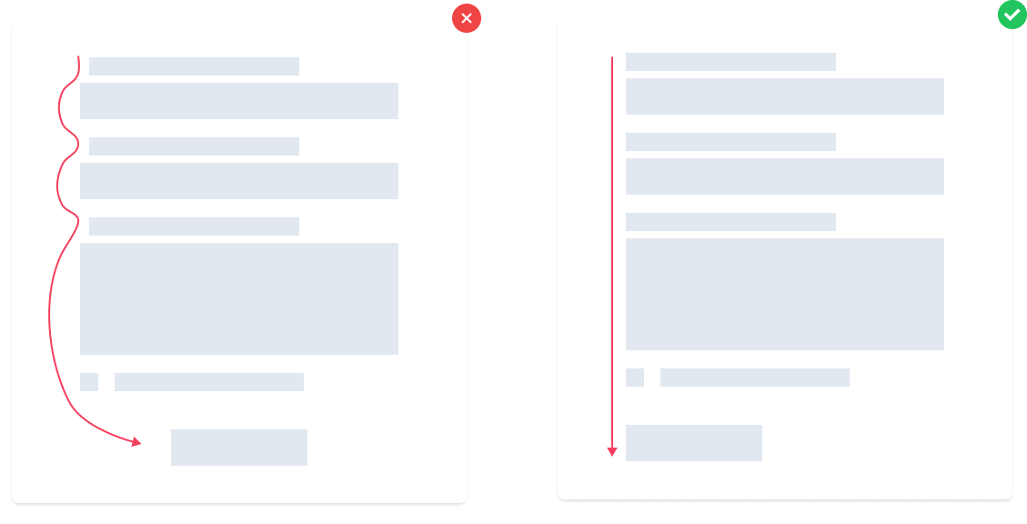
In the example below, the “correct” option depends on how saturated the gray background block is. If it’s too dark, the right option might be more balanced. If it’s light, both versions may work fine.
Highly saturated backgrounds have more visual weight. Extending them past the text can break composition and draw too much attention. Keeping them the same width as the paragraph helps maintain focus.
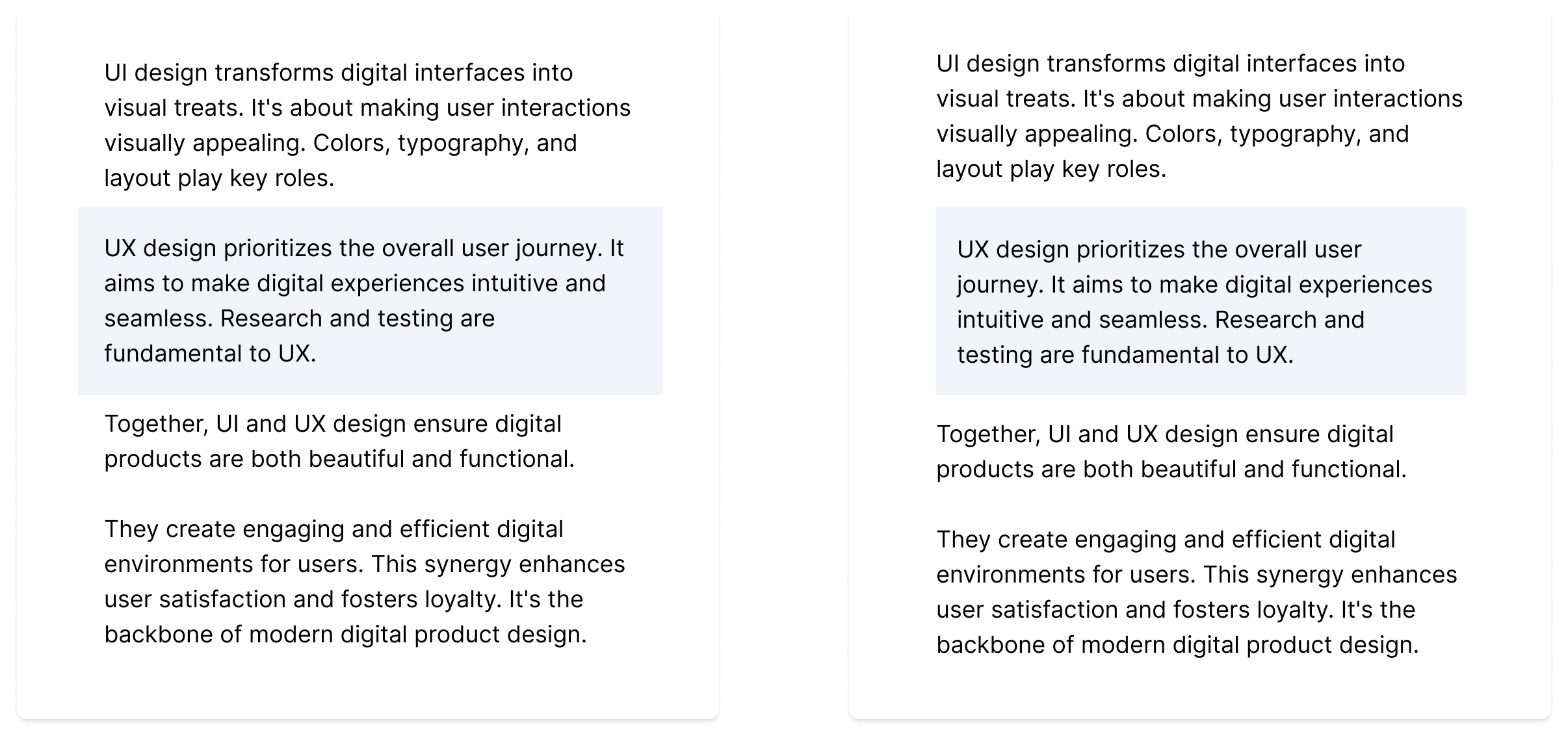
Here, the right option seems better — but I’ve seen both used in UI kits. And honestly? I’m ambivalent.