Consistency and Standards
Users should not have to wonder whether different words, situations, or actions mean the same thing. Follow platform and industry conventions.
This one is closely related to Jakob's law:
Users spend most of their time on other sites. This means that users prefer your site to work the same way as all the other sites they already know.
I would say this is really important and often overlooked. Every time you try to implement a feature, there are high chances that something similar already exists.
Before making the feature, check other apps. For example, there are things that became widely recognized patterns:
- A search bar is usually placed at the top
- Navigation is rarely placed at the right side, usually on the left or top
- The three dots icon usually opens a dropdown with actions
While these might sound very simple, complicated features also have recognizable patterns. That's why it's very important to check for references before building something.
Some examples of applying the consistency and standards heuristic
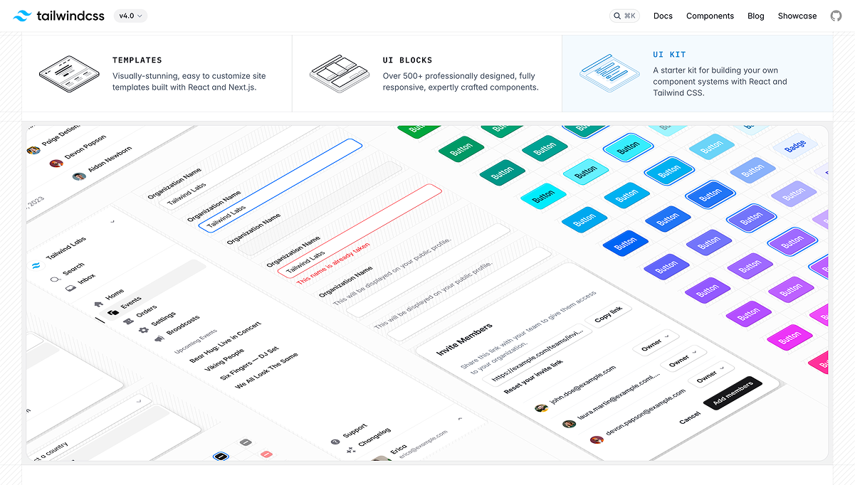
Uniform Button Styles
Across a website or app, buttons for primary actions are consistently styled (e.g., color, size, shape) to indicate importance, while secondary actions use a distinct but uniform style.
Standard Icons
For example, you can use a magnifying glass icon for search and a trash can icon for delete, as these are universally recognized symbols.
Consistent Navigation Placement
Websites place the main navigation bar at the top or on the left side, ensuring users know where to look regardless of the page.
Uniform Form Design
Input fields across all forms follow the same design pattern (e.g., rounded corners, consistent spacing, and error messages displayed below the field).
Same Terminology Across Features
A banking app consistently uses "Account Balance" rather than mixing it with terms like "Available Funds" or "Remaining Balance" in different places
Standardized Error Messages
Error messages across an application follow the same tone, format, and structure, such as "Something went wrong. Please try again."
Reusing Interaction Patterns
A mobile app uses the same swipe-to-delete gesture for items in different sections, such as messages and notifications.
Platform Conventions
An iOS app adheres to Apple's Human Interface Guidelines, using native components like tab bars and back buttons in the standard positions.
Aligned Page Layouts
E-commerce sites maintain consistent layouts for product pages, with the product image on the left, price and title at the top, and "Add to Cart" buttons in the same position on every page.
Standard Color Use
Red is consistently used for errors, green for success, and blue for informational actions across the interface, following common conventions.