Contrast in Design
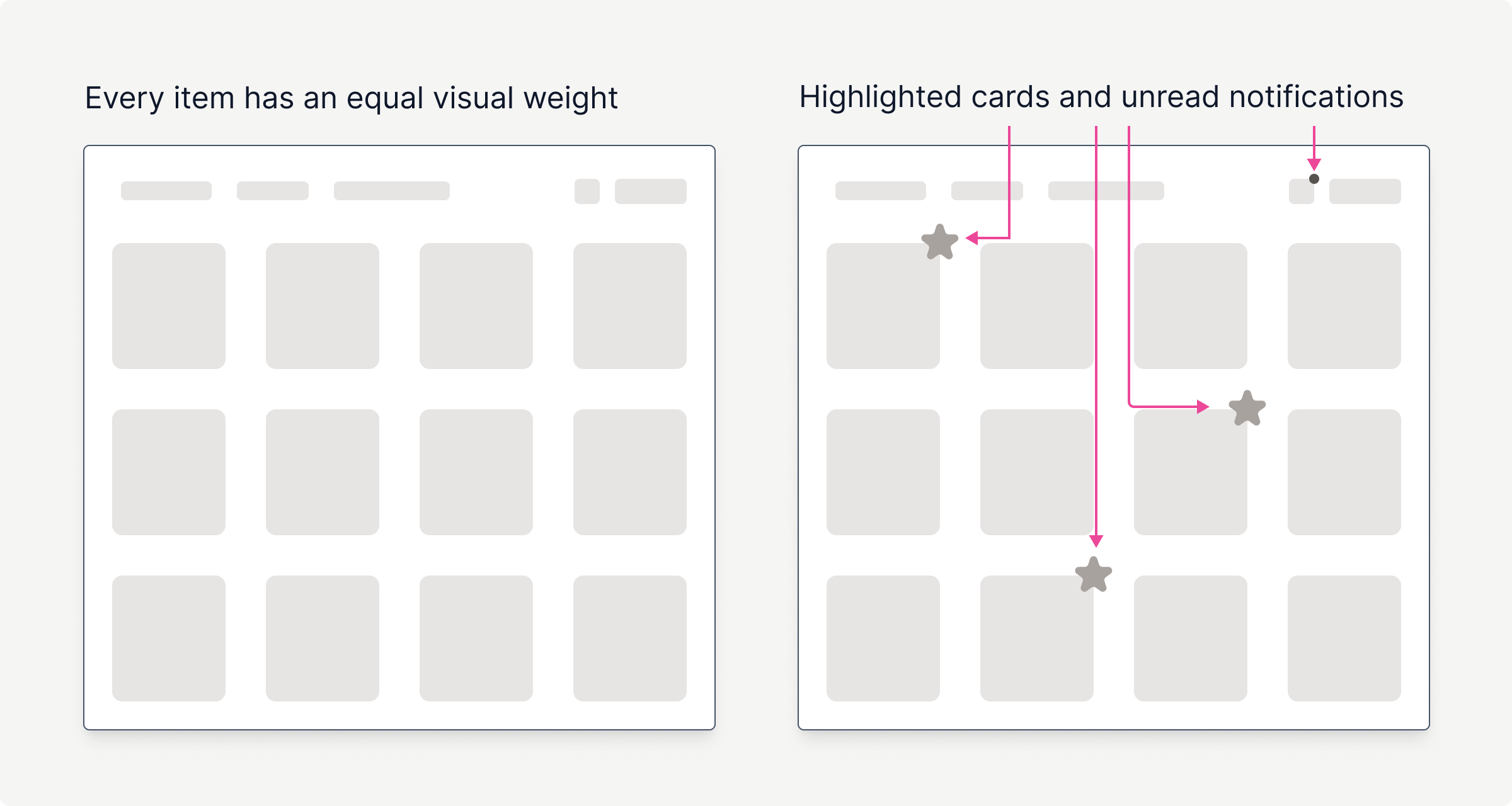
Contrast is all about making certain elements stand out in your design. You can achieve it through various methods, not just by experimenting with color, which remains the most straightforward approach.
If we talk in general about contrast (not the one that is checked via WCAG rules for being accessible), this technique is used to draw people's attention to something. There are numerous ways to accomplish this; here are a few examples.
Color
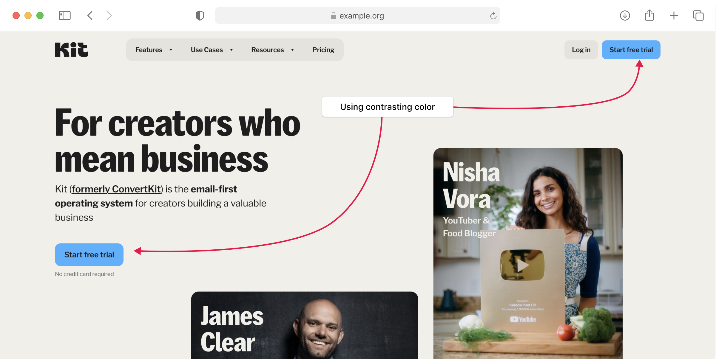
Using contrasting colors is the easiest way to make an element stand out. Typically, we refer to these as primary or accent colors. These are not the same notions.
The brand identity is defined by the consistent use of primary colors across various elements. While accent color is used sparingly to draw attention to important things. Generally, you will use accent color far less frequently than primary color.
However, keep in mind that the more colors you use, the less contrast you have. Well, that's not correct to say "less contrast"; you will have less focus on certain elements that you wanted to highlight. In other words, you don't use contrast properly.
Here is a very typical color usage from Kit.

Size
Apart from color, you can operate with elements' sizes. If you have 20 cards and one of them is twice the size of the others, it will stand out.
I've come across a funny example on Gumroad. My avatar is tiny, while the dashboard is huge. Even though the button has a primary color, my avatar would compete for attention if it was the same size and had different colors.

Shape
Using different shapes also make elements stand out. The most typical example is price discount tags, or any other tags or ribbons, since they have different shapes. But usually, when you use a different size or shape, you accompany this with a different color. It depends on the case, though.

Typography
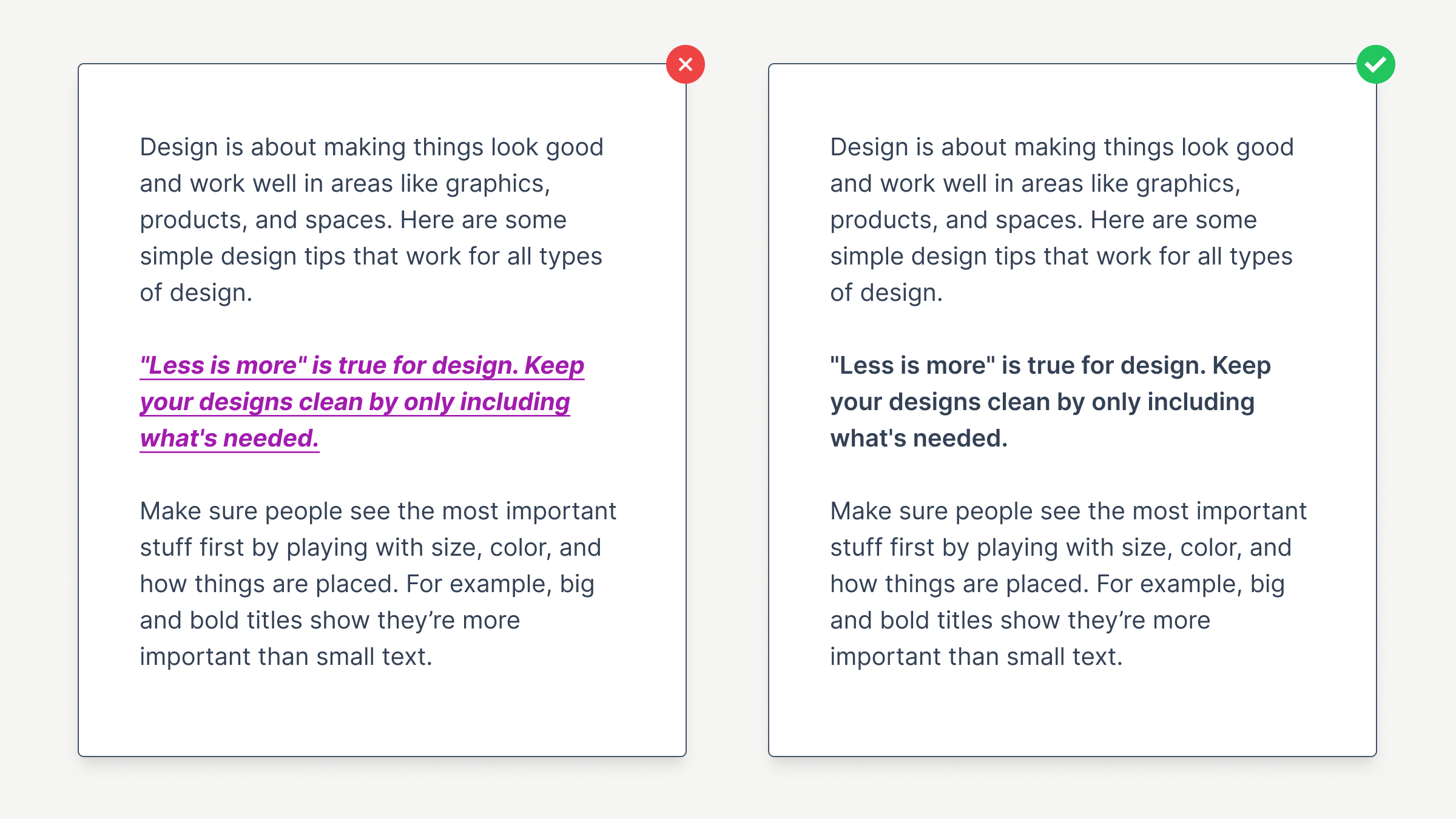
Using different font styles will make contrast in your text. Remember one of the most common mistakes: applying too many styles on the same text. Most of the time, it's enough to use one method rather than make bold, italic, or bigger, colored text. You overemphasize this way.
